Our Master Bedroom Design Adjustments
Back in 2019, we did the infamous huge renovation, including our master bedroom. The big design change we did in this room was vaulting the ceiling which made such a difference in the space. While we don’t have the biggest master suite and bath, the now 14’ high ceiling added a nice punch to the room that made it unique to the rest of the house. I didn’t spend too much time re-designing this space because while a nice chunk of the house was still living in its original condition (our house was built in 1938), our bedroom was an addition to the house. Although we understood there wasn’t a permit pulled when it was built, we knew the addition was new enough to not need as much correction to bring it up to our city’s code requirements.
So we kept things simple. The bathroom did get a pretty big flip, but the bedroom had some insulation put in the ceiling, new drywall on the ceiling, and lastly a paint job. The only bit of character was the vertical shiplap as an accent wall our bed sits on. Boom, done, called it a day—to put it frankly.
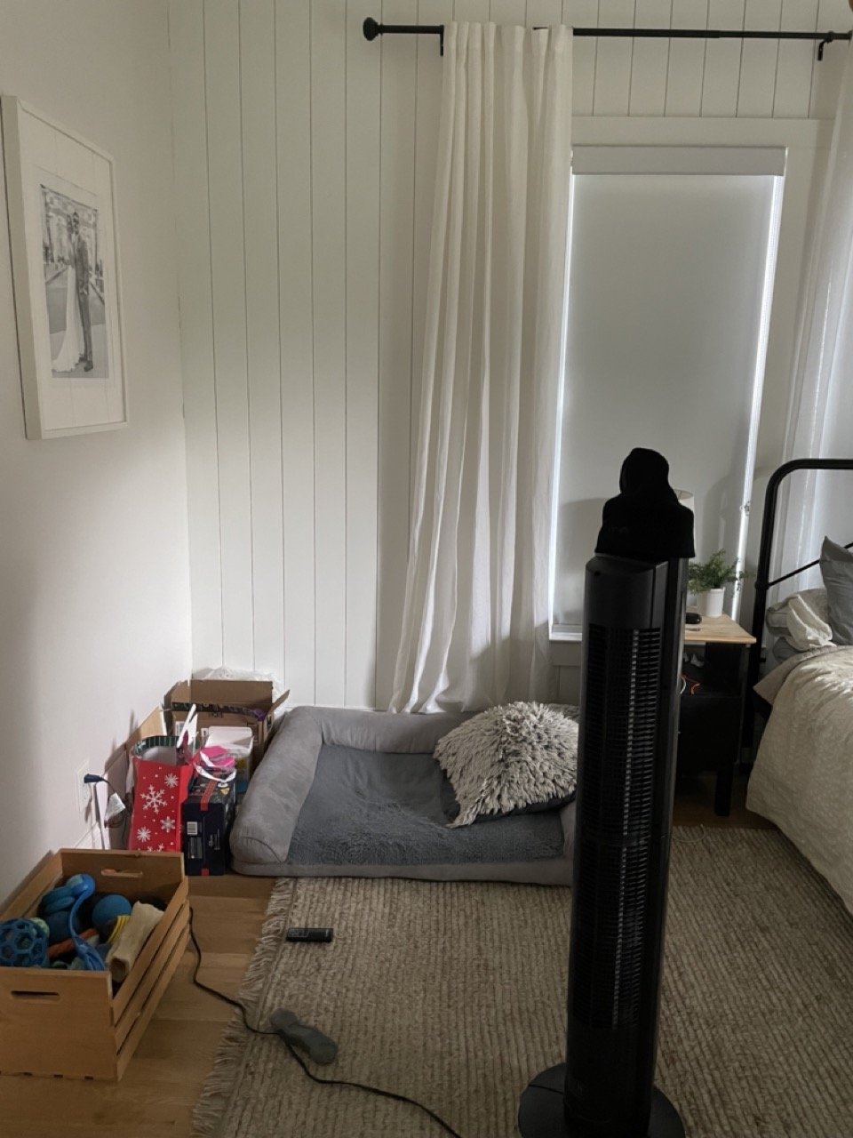
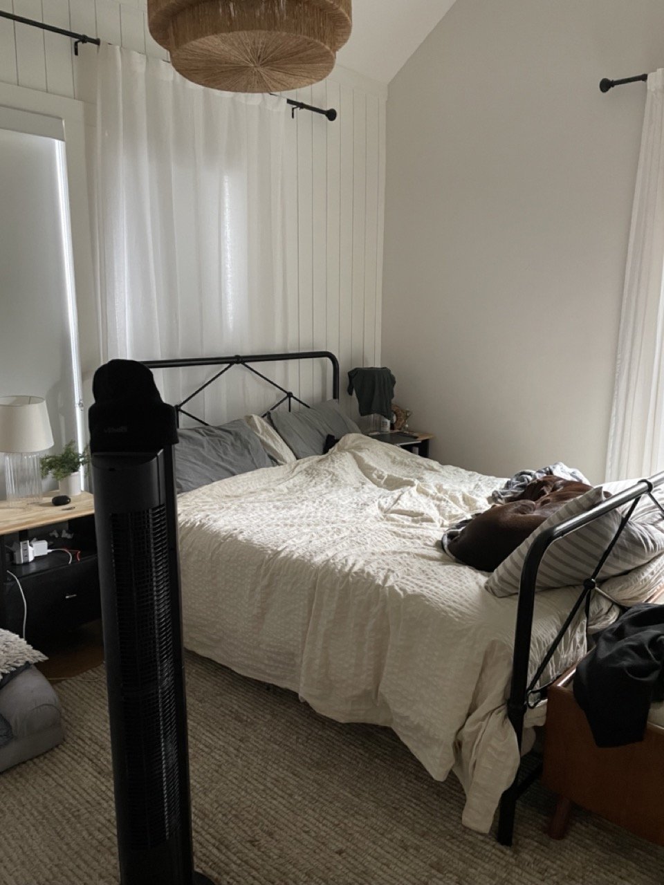
Fast forward to today, this room has had a hard time keeping up with demands for our routines and livelihood. It’s pretty embarrassing, to say the least. I mean, just look at how much this room has fallen off the wagon. I don’t know if I’ve ever designed a room that has had two before and after shots of it. It’s so sad, it’s honestly hilarious. Anyways, it has a great starting point. I mean that 14’ vaulted ceiling is just begging to be glorified. But beyond the ceiling, or more so the aesthetics of the space, the functionality is the real problem here. Here are a couple of goals we have for the space:
-Better mood lighting
There are a couple of ways I want to make this happen. First, our recessed lighting as well as our pendant are both dimmable. We just never installed a dimmer on the light switch. That’s an easy fix. The second way is that I want to swap the bulbs out in our lamps for smart bulbs like the ones you see here. There’s an app they connect to and we’ll be able to do all sorts of fun lighting in this space. Depending on the budget and what we can swing, I might just replace the lamps with wall sconces but we’ll see.
-Faux beams
I would like some zing put on these ceilings to really ka-pow them, ya know? I love the idea of a monotone ceiling similar to this design above by Amber Interiors. This project is a little intimidating, to be honest. And I also don’t know why it intimidates me, but I’ve seen so many DIY women before me throw faux beams up on their ceilings like it’s nothing. So I’m planning on harnessing all my courage and doing something a little past my comfort zone.
-A closet makeover
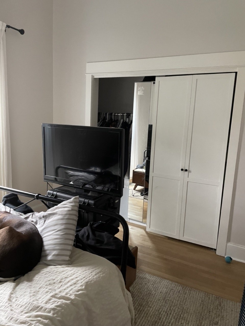
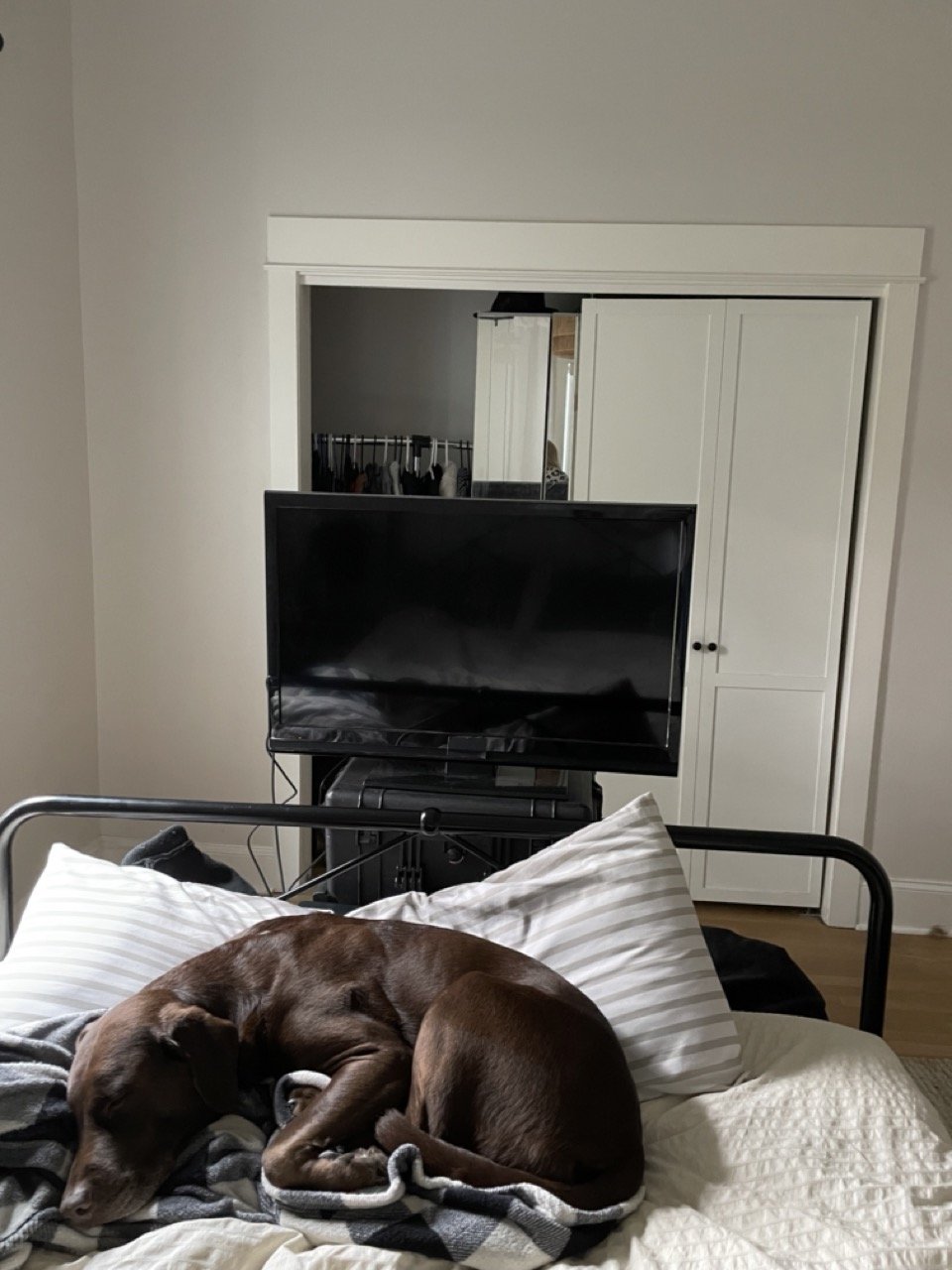
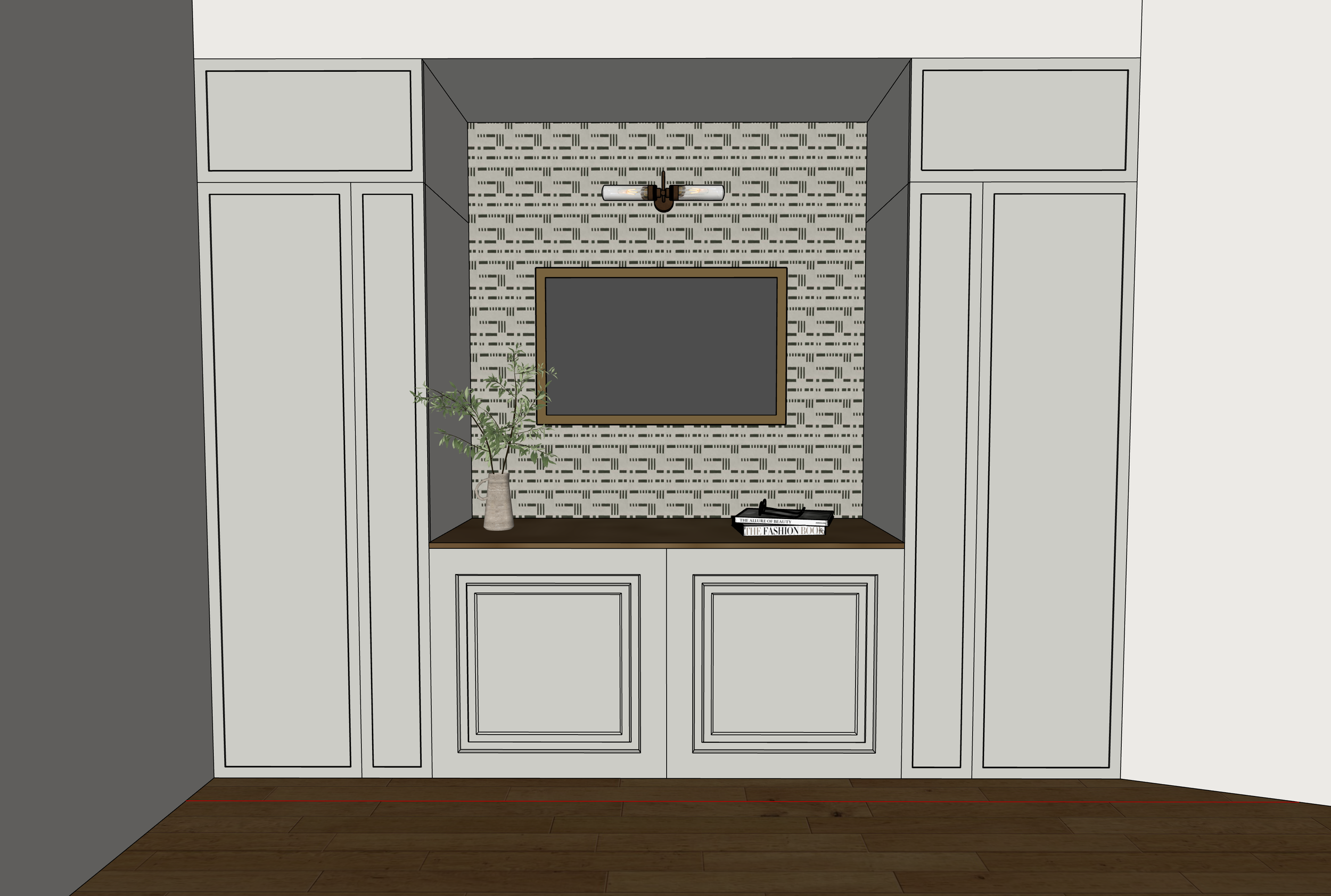
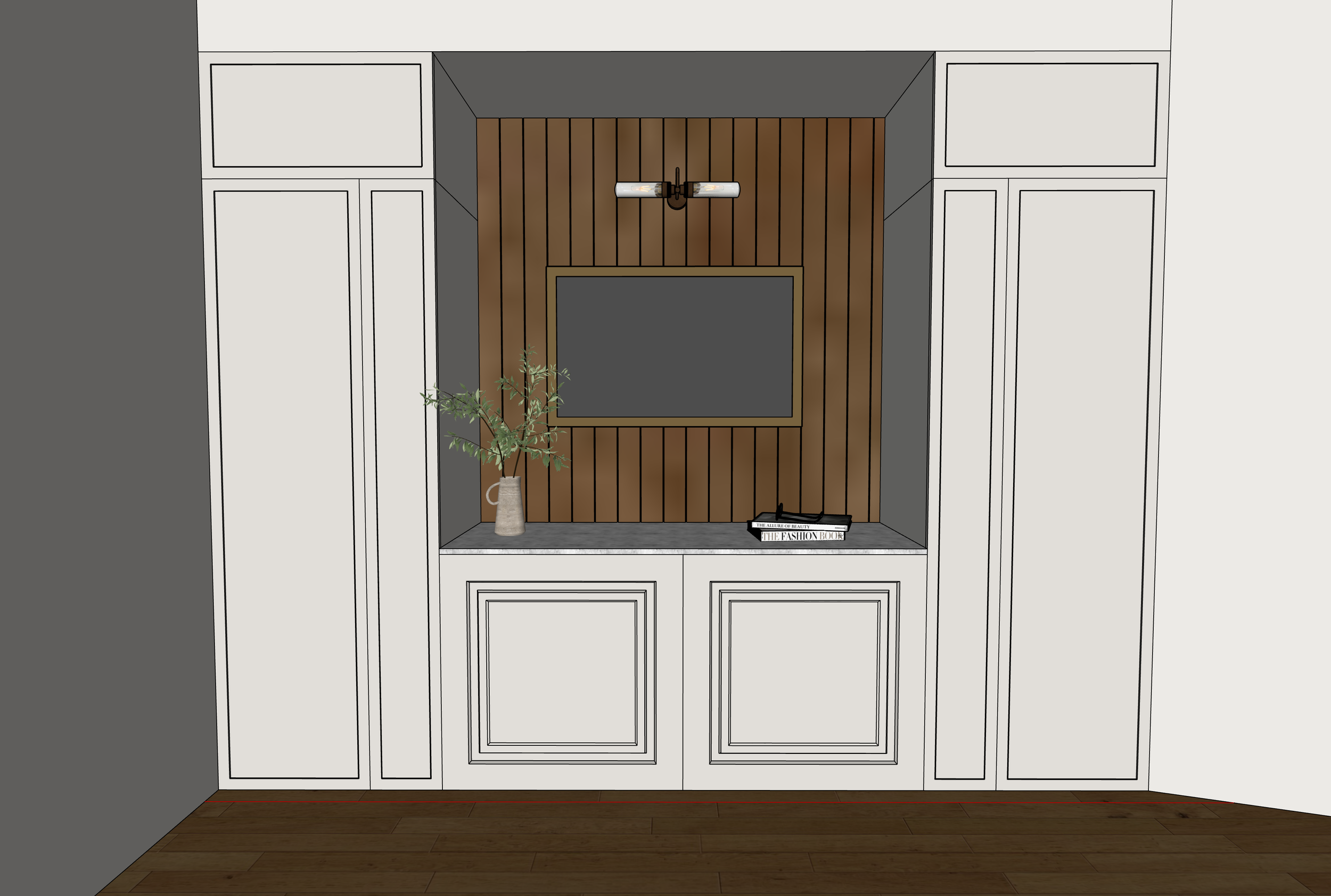
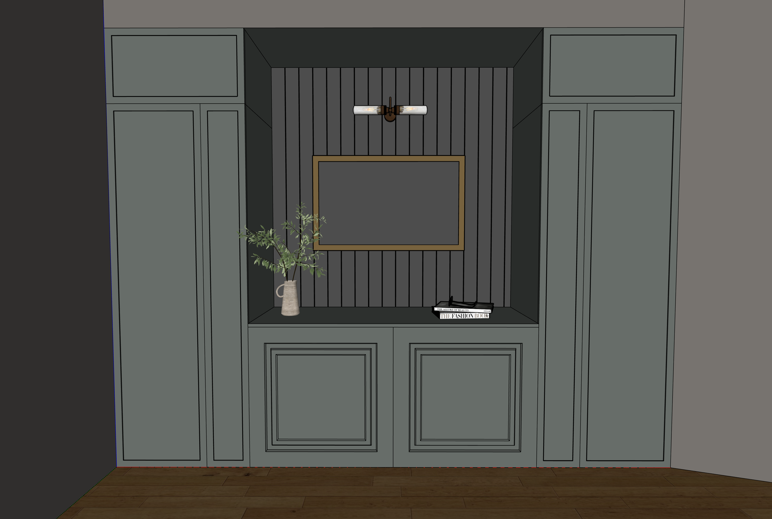
This is the big one! Our current closet is truly embarrassing. We hung our clothes on these rolling racks since we did our renovation. So that’s 4 years total! While I did invest in this Pax system, it’s bulky and takes up a huge chunk of closet space. It is weird opening our bi-fold doors and then opening up another door, which then allowed us to open up our drawers to finally access our clothes—it’s not ideal. Our closet is also very long on the inside but the framed doorway into the closet is small enough that it’s hard to reach our clothes that sit in the back. Lastly, my husband, Ryne, and I realized that we very much enjoy watching TV in our room. There’s a design rule against it somewhere, but this is just how we like to live. We enjoy snuggling in bed, and watching TV or playing video games together once the baby girl is asleep. And our current setup is hilariously crafty, but mostly an eye sore and probably a little unsafe. All in all, you can see above what we’re looking at for an initial design. His and her’s closets, a dresser in the middle, and a TV safely hung on the wall—wires out of sight. I am still debating over the aesthetics of it though, and ultimately, whatever I do decide will determine if and what I need to paint or not paint in our bedroom. This brings me to the last, possible goal:
-New Design Aesthetic?
There’s a question mark here because I do like how light and bright our room is…when we pull the shades up…if we pull the shades up. We hang out in our room the most at night, and we like it dark in here, so why not just go all dark and moody with the space, ya know? Again, it’s a little intimidating, but this sort of makes sense to me. I also LOVE a bright open airy room—it brings me the most comfort and creativity. Hence why our main living space is so bright and open. There's a special joy I feel in that space and am immediately drawn to it. I’m going to let this decision simmer but am open to others’ thoughts on which direction I should go.
So this is where we’re at, and what lies ahead for this room. I’m excited to see it all come together and anxious to get started.


